I’ve had a fun few days messing around with the blog. The trigger was some feedback from a first time visitor. They found the long, seemingly endlessly scrolling, list of posts intimidating and hard to navigate. I’d always planned to add more structure to the blog but that’s hard to do without a reasonable amount of content to seed it with. Clearly, I now had enough posts to test out whatever navigation scheme I came up with.


The first difference you’ll notice (if you’re carefully scanning the home page left to right and top to bottom) are two new entries in the site menu: Posts and Topics.
Posts
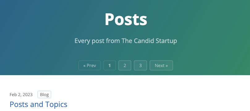
Posts takes you to a paginated list of all my posts. I looked at a few different styles for pagination controls using the Jekyll Showcase of sites built with Jekyll. Eventually I settled on the approach used by the Mozilla Release Management Blog.


I experimented with a few different options for placement. I wanted a decent number of posts on each page (some scrolling is inevitable) so decided on duplicating the navigation controls at the top and bottom of each page. Originally, I had them in the main body of the page. However, it wasted a lot of space at the top of the page and I couldn’t get it to look right visually.
I cracked it once I realized that I could move the controls into the page header. No additional space needed and the buttons look great with the page header background. I added a page footer with the same background for the controls at the bottom of the page.
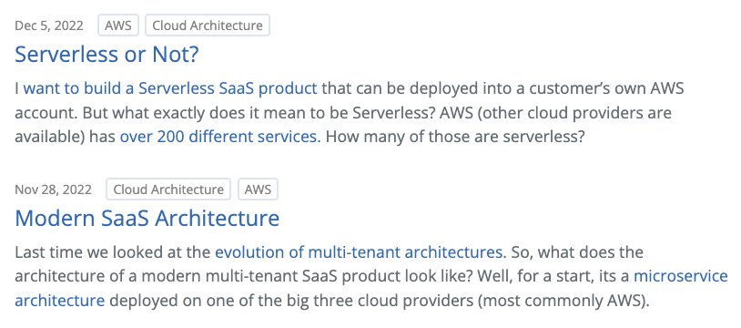
The eagle eyed amongst you will have noticed the other new feature: topic badges. Each post is classified as relevant to one or more topics. For example, this post has the Blog badge. The topic badges are also buttons that take you to a page for each topic.
Topics
The Topics site menu entry takes you to a page listing all the topics covered by my posts so far. Each topic has a dedicated page with a brief description and a list of all the posts on that topic. One subtle bit of design is that the topic badges on each post are ordered based on relevancy.


My Serverless or Not? post is mostly about AWS, but also touches on Cloud Architecture. Meanwhile, my Modern SaaS Architecture post is about Cloud Architecture in general, but uses AWS for some examples.
A Post
Each post gets its own dedicated navigation controls. Once you’re immersed in a post, you can use the controls to move straight to the next or previous post. You can also use the topic buttons to take you straight to more posts on the same topic.


There’s another bit of considered design here. There are multiple ways to reach a post. You could have come from the home page, the Posts page or a Topic page. So, what is the next post? Is it the next post chronologically, or the next post on that topic?
I decided to make it the next post chronologically. To provide an affordance for the user, the button is labelled with the date of the next post rather than the word “next”.
Home Page
Now that the complete list of posts has its own dedicated area, I can be a bit more considered about what lives on the home page. The intention is to encourage a first time visitor to explore further, rather than pressing the back button on their browser. The content is kept short with the hope that most of it will be visible above the fold.
Latest Posts
This is a blog, so it’s all about the posts. I’ve kept the latest posts section but restricted it to the most recent three posts. To keep things compact, the excerpt from each post is limited to 30 words (in the posts and topics areas you get the complete first paragraph).
What if the first three posts don’t hook them? That’s what the next two sections are for.
More Posts
I want to provide a way for someone scanning the first three posts to know that we have more posts available and make it easy for them to dive in. It will break their flow if they have to look around to find the site menu.


Originally I just added a More Posts link to the bottom of the list of the three latest posts. To make it flow visually I used the same style as a regular post link. But a regular post link has a date, and topic badges, and an excerpt.
I may have got a bit carried away.
I’m pleased with how much context I managed to pack in. The date shows the range of dates for the remaining posts, giving you an impression of the scope of what’s available. Similarly the topic badges let you know more of the topics covered here. As the blog grows, the list could get out of hand, so I’ve limited it to the 5 most popular topics. Having the badges in popularity order echoes the relevancy based order on each post.
There’s another subtle bit of design here. I’m limited to showing 5 badges. However, the user already knows the topics covered by the three latest posts. There’s no point repeating those badges here. If those topics don’t hook the visitor, I want to show them what other topics we have. So, I remove the already mentioned topics from the list.
Finally, I generate an excerpt that tells you exactly how many more posts and topics you have to look forward to.
Hot Topics
If they make it all the way to the bottom of the page, there’s one last treat in store for them. A word cloud showing each topic with the number of posts for that topic.


Hmm. Maybe I should talk about something other than Autodesk …