I’m working on a cloud spreadsheet system. It will support spreadsheets with millions of rows and columns. Potentially far more data than will fit into client memory, particularly a web client. Which means I need a front end implementation that can handle that.
Given that I have zero practical web front end development experience, where do I start? Which buzzwords do I need to include in my searches to bring up the right information? I know I’ll have some sort of grid control that provides a window on a small portion of the data. It’s a spreadsheet so users will expect to use scroll bars as the main way of moving the window around.
A few quick searches later and I have a shortlist of buzzwords: paged, infinite and virtual. But what do they mean?
Paged vs Infinite vs Virtual
The best explanation I found, was in a post by David Greene on Medium. The main focus of the post is a benchmarking comparison of different JavaScript grid controls. I think David was a marketing manager at Sencha, the creator of the ExtJS Grid, so take the benchmark results with a pinch of salt. However, the post starts off with a very clear and helpful definition of terms. It’s well worth your time to read the original, but here’s an executive summary:
- Paging: Users jump backwards and forwards through the data set, a page at a time. Just like the Posts section of this blog.
- Infinite Scrolling: A subset of data is loaded into the grid control. Users can scroll through it. If they reach the end, more data is loaded and the scroll bar grows. The scroll bar doesn’t show the total amount of data available.
- Virtual Scrolling: The scroll bar reflects the total amount of data available. Users can scroll seamlessly through the entire set. As they do, data is loaded (and if necessary unloaded) behind the scenes.
Got it. Clearly, I need to implement virtual scrolling. Now, how do I do that?
Panning for Gold
I tried a few different variations of “implement virtual scrolling” search terms. All that I got back were adverts and marketing for commercial grid controls. Out of desperation I even fired a few up and poked around in Chrome developer tools. All that told me was that the control’s DOM contained elements that were visible in the grid. Then, buried under many layers of abstraction, scroll events would result in updates to the DOM to add and remove elements.
I want to understand the detail of how it works. What are the limits? Where are the edge cases that will catch you out? How can you work with the browser platform rather than fighting against it?
Eventually I stumbled across one Stack Overflow question asking about some of those edge cases. Any virtual scrolling implementation that works with the DOM consists of a fixed height parent container with a larger child that it scrolls over. How do you manage the scroll bar so that it reflects the size of the complete data set, even though only a fraction of it is loaded? As the user scrolls, new content has to be added to the child. How do you manage the scroll bar so that it behaves as if the user is simply scrolling through the entire set?
As the user begins to scroll down, the implementation has to add new content to the end of the child before it scrolls into view. The top of the scroll bar handle stays in the same place. However, when the user scrolls up, new content has to be added to the beginning of the child. This has the effect of pushing the existing content down. The scroll bar handle position needs to be adjusted so that the existing content stays in the same place.
What’s the best way of doing that? How do you stop the browser repainting before you’ve finished all the adjustments? There was a suggestion that the browser might “glitch” with the content pushed down and then jumping back into place.
As is often the case with a really technical question on stack overflow, there were no replies apart from a later follow up by the original author reporting the solution they’d used.
When do DOM changes become visible?
That’s interesting, I thought. How do DOM updates interact with rendering? Is it a browser specific implementation detail, or something you can rely on?
The basic principle is that everything is driven from JavaScript’s event loop. The event loop triggers some of your JavaScript which updates the DOM. The DOM is marked as dirty. Your code eventually completes, or performs an async operation, which returns control back to the event loop. The event loop will eventually schedule a render. Browsers try to batch up changes and limit how often renders occur. Typically no more than 60 times a second.
If you want to ensure that a set of changes are all made together, you need to make them all synchronously. It will often still work if you have a few asynchronous calls, but there’s always the chance you’ll be unlucky, hence the reported “glitching”.
If you’re making a really large set of changes, you could build the new version of the page as a DocumentFragment, unconnected to the live DOM. You can then replace content in the DOM with content from the DocumentFragment in one go.
Chrome RenderingNG Architecture
Does a modern browser really work this way? In this age of multi-core CPUs, it seems crazy to run everything on a single thread managed by an event loop. An architecture that relies on everyone being a good citizen and NOT running long sections of synchronous code.
The Chrome team have a great series of blog posts that describe how rendering is actually implemented in Chrome. There are multiple threads and multiple processes. Large parts of the rendering pipeline don’t use the main thread. Some common interactions, such as scrolling a web page where the DOM hasn’t changed, don’t touch the main thread at all.


Despite all that, the core semantics remain intact. Most of the work happens in other threads and processes. However, the DOM Change and the document lifecycle that ends with the render being triggered are still managed by the main thread event loop.
React Virtual DOM
I was still curious. Modern UI frameworks, like React, have layers of abstraction. They’re packed with callbacks, events and other asynchronous control flow. React has a Virtual DOM model, where you make changes to a lightweight representation of the page, and React works out how to apply those changes to the actual DOM.
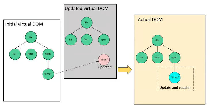

React uses a three phase process to implement this. First, a React application triggers a Render. Despite the name, no actual rendering occurs. Instead, the tree of React components returns the current state of the virtual DOM that represents what the application would like to be rendered. Second, React runs a Reconciliation algorithm which compares the current and previously rendered virtual DOM, and generates a list of updates that need to be applied to the actual DOM. Finally, React Commits those changes to the actual DOM.
All the heavy lifting is done in the render and reconciliation phases. React can return control to the event loop during these phases and resume later. However, the commit phase is always executed synchronously, so the browser will never display a partially updated DOM.
Virtual Scrolling Implementation in React
I’ve gone down a few rabbit holes. Was it useful? As often happens, coming at something from a different angle can help unblock you.
I found a wonderful blog post that shows how to implement virtual scrolling in React. The principles are clearly explained, together with a basic working implementation. The same principles will work with any other UI framework. The idea is that the child container, which the control scrolls over, has a fixed height that matches the height of the complete data set. The child contains the currently loaded rows sandwiched between two padding containers that represent the unloaded virtualized rows.
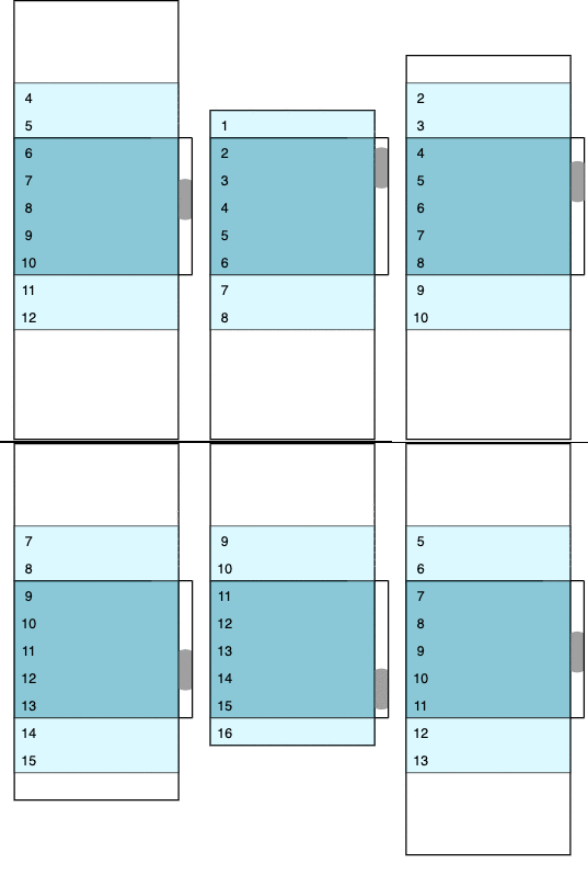

As the child container is always the same size as the complete data, the scroll bar works naturally without any special case code needed. As the scroll bar position moves, the child container is rebuilt. Rows are inserted or removed and the size of the padding containers adjusted to match. In the animated diagram, dark blue is used for visible rows, light blue for rows that are loaded but currently out of view, and white for the padding containers.
How does Google Sheets work?
I think I’m ready for the big league. I understand the principles. Now let’s see how they’re applied in Google Sheets.
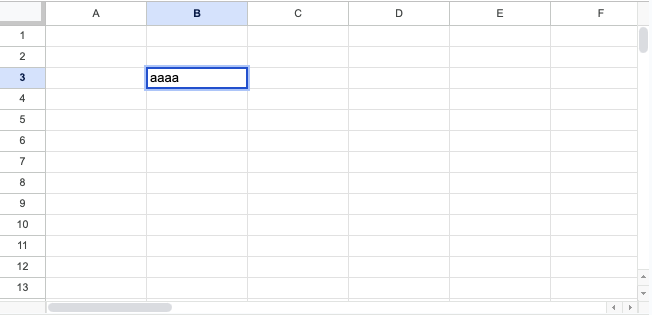

Easy. I should see a parent container that represents the spreadsheet with a bigger child container which has HTML elements for the loaded cells and maybe some padding out of view. I fire up Chrome developer tools and see nothing like that. Once you strip away all the cruft, there are actually only four HTML elements of any interest.


The entire visible grid is represented by a Canvas element. Rather than continually updating a DOM representation of the cells in the spreadsheet, Google Sheets just draws it to the canvas. The canvas is only used for “background” elements: the grid lines, text labels and content. More active elements such as selection highlights and text input boxes are represented by html elements that overlay the canvas. When you double click on a cell to start editing, a text box is placed over it.
The scroll bars are interesting. These are “native” browser scroll bars. The implementation should be familiar. There’s a fixed size parent container (positioned as shown by the green and red boxes). Inside each parent there is a much larger transparent child. In the horizontal scroll bar it’s thousands of pixels wide and one pixel high. In the vertical scroll bar it’s thousands of pixels high and one pixel wide.
Google Sheets is using a basic virtual scrolling implementation simply to trick the browser into displaying the scroll bars it wants. It then uses scroll events to redraw the canvas to match.
