I’m about to add support for editing data in my React spreadsheet component. Before I can do that, I need to be able to select the cell I want to edit. Before I can do that, I need to add some grid lines to make it easier to see where the cell boundaries are.
Grid Lines
I’m lazy, so my first move is to look at Google Sheets and see what it does. It has a very clean look with single pixel wide light grey grid lines running from the headers right through into the grid.
Google Sheets isn’t going to give me a helping hand when it comes to implementation. The entire spreadsheet is a Canvas element with the grid lines drawn on. I’m using HTML and React so need to do it with CSS.
My first try was to add a border around each cell. That ends up looking ugly with double width borders where cells share an edge. The default HTML layout draws borders around the outside of each cell, which makes things more challenging.
I used the box-sizing property so that border and padding are included in each cell. I avoided double width borders by ensuring that only one element draws each border.
.VirtualSpreadsheet_Column {
  box-sizing: border-box;
  border-right: 1px solid lightgrey;
}

.VirtualSpreadsheet_Row {
  box-sizing: border-box;
  border-bottom: 1px solid lightgrey;
}

.VirtualSpreadsheet_Cell {
  box-sizing: border-box;
  border-right: 1px solid lightgrey;
  border-bottom: 1px solid lightgrey;
}
Bad Alignment
Now that I have grid lines, it’s much easier to see a problem that I’ve been vaguely aware of and ignoring for a while. When you scroll to the end of the grid, the header and grid content don’t match up.
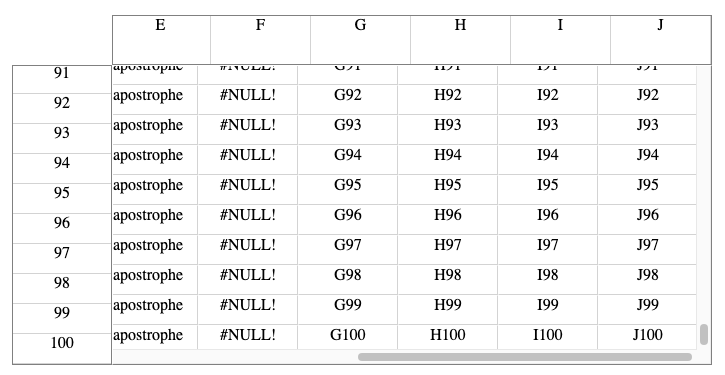
I implemented the headers as a quick hack using VirtualList with the scroll bar hidden. I set the scroll offset in each header whenever the grid is scrolled. When you scroll the grid to the end, the offset I try to set on the header is out of range and gets clamped.
I need something else past the last item in each header that can be scrolled into view. Eventually, I’ll get around to implementing custom header controls. For now, I fixed it by adding an extra dummy blank item to each header.
Selection
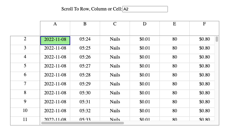
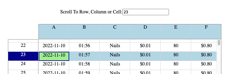
In Google Sheets, you can select a cell by clicking on it or by entering the cell reference in the name box. You can select a row or column by clicking in the header. You can select a range of cells, rows or columns by clicking and dragging or entering a cell range in the name box.
Whatever you’ve selected, there’s alway one focus cell highlighted with a dark blue outline. This is the cell whose content changes if you start typing. If you’ve selected a row, column or range, the first cell in the selected area has the focus.
The arrow keys, tab and return move the focus from cell to cell. The arrow keys also change the selection to the focused cell, while tab and return move the focus cell within any existing selection area. If a row is selected, focus moves to the right, otherwise it moves down a cell.
When a cell is part of a selection, the corresponding row and column in the headers are highlighted in light blue. When a row or column is selected, the headers are highlighted in dark blue and the cells in the selected rows or columns are highlighted in light blue.
Current State
I already have a selection state which can represent a cell, row or column. Currently the only way of selecting something is via the “Scroll To” box. That’s good enough for now. In future, I’ll need support for range selection and the ability to select using mouse and keyboard.
We need separate state to keep track of the focus cell. If more than one cell is selected, only one cell in the selection will have focus. The focused cell can also be moved around within the selection.
Focus Cell
I added focusCell state which currently only gets updated when the selection changes. I also need an effect to actually give focus to the cell after it’s been rendered.
const focusCellRef = React.useRef<HTMLDivElement>(null);
const [focusCell, setFocusCell] = React.useState<[number,number]|null>(null);

React.useEffect(() => {
  focusCellRef.current?.focus()
}, [focusCell])

...

setSelection([row,col]);
if (row === undefined && col === undefined)
  setFocusCell(null);
else
  setFocusCell([row ? row : 0, col ? col : 0])
I changed the Cell component to render an alternate version if the cell is focused.
const Cell = ({ rowIndex, columnIndex, style }: { rowIndex: number, columnIndex: number, style: React.CSSProperties }) => {
  const value = (rowIndex < dataRowCount && columnIndex < dataColumnCount) ? formatContent(data, snapshot, rowIndex, columnIndex) : "";
  if (focusCell && rowIndex == focusCell[0] && columnIndex == focusCell[1]) {
    return <div
      ref={focusCellRef}
      className={join(theme?.VirtualSpreadsheet_Cell, theme?.VirtualSpreadsheet_Cell__Focus)}
      tabIndex={0}
      style={style}>
      { value }
    </div>
  } else {
    return <div className={theme?.VirtualSpreadsheet_Cell} style={style}>
      { value }
    </div>
  }
};
The DOM focus() method only works if the element has the tabIndex property set. The value of 0 leaves it up to the browser to decide where to insert in the tab order. We also need to bind the element to focusCellRef so that it can be accessed by the effect.
The last change is to add an additional BEM style “modifier” class name to expose the focussed state to CSS.
.VirtualSpreadsheet_Cell__Focus {
  border: 2px solid darkblue;
}

.VirtualSpreadsheet_Cell__Focus:focus {
  outline: none;
}
As well as defining my own style, I also disable whatever focus highlight the browser might apply so that the two don’t clash. I need my own highlight for the focus cell because it continues to be the focus cell even if the user moves the input focus elsewhere. For example, they might use the formula box (coming soon) to edit cell content rather than doing it in place.
To help with debugging in my sample app, I also changed the background color of whatever element has input focus.
:focus {
  background-color: lightgreen;
}
Losing Focus
Look at that, it works.
Or so I thought. Eventually, I noticed that the focus cell would lose input focus every so often without me doing anything.
I still had my boring data source active, with a new row being added every minute. It took an embarrassingly long time to work out that focus was also lost once a minute, when the new row was added. In my defense, the changes were happening out of sight at the other end of the spreadsheet.
Why is focus being lost? The change in the data store will trigger a render but nothing has changed in the visible part of the spreadsheet.
I had to drill in using Chrome developer tools and the React profiler. I found that all cells (in both the grid and the header) were being recreated from scratch every render.
Reconciliation
Time for a refresher on the React reconciliation process. React compares previous and newly rendered JSX to work out what changes need to be applied to the DOM.
When comparing interior elements in the tree, React tries to match up corresponding children in the old and new tree. Any unmatched child in the old graph needs to be removed from the DOM. Any unmatched child in the new graph needs a new element added to the DOM. Otherwise, React edits the existing DOM element to apply the changes from old to new.
The profiler shows that cells are not being matched at all. All existing cells are removed and new ones added. React uses keys defined on each child to match them up. The keys look fine to me.
This is a common question on StackOverflow. Part of the reconciliation story that I’d glossed over is that children can only match if they have the same type. Which again looks fine to me. All cells in the grid use the Cell component. Of course they’re the same type.
They’re not. In modern React a component is a function. The Cell component depends on context from VirtualSpreadsheet, so I implemented it as a nested function. Which means that it’s a different function instance each time VirtualSpreadsheet renders. Cue another learning moment.
Don’t define nested React components. For class components, don’t define components inside the render function. For functional components, don’t define components in the function body.
The Fix
I used nested components because I need to capture context from VirtualSpreadsheet. If I move the Cell component to the top level I’ll have to pass that context through as a prop. Which means passing it all the way through VirtualGrid to each Cell component that it creates.
Luckily, I have an itemData prop on VirtualList and VirtualGrid for just this purpose.
Working with explicit context can get very verbose. I could create an object with properties for everything that’s needed, but that’s a lot of ugly boiler plate code. The alternative is to use a render prop. My current nested component becomes a nested function that returns JSX when called. I pass this as a prop to a stub Cell component that renders whatever the function returns.
type CellRender = (rowIndex: number, columnIndex: number, style: React.CSSProperties) => JSX.Element;
function Cell({ rowIndex, columnIndex, data, style }: { rowIndex: number, columnIndex: number, data: unknown, style: React.CSSProperties }) {
  const cellRender = data as CellRender;
  return cellRender(rowIndex, columnIndex, style);
}
The code in the nested function is exactly the same as in the original nested component
const cellRender: CellRender = (rowIndex, columnIndex, style) => {
  const value = (rowIndex < dataRowCount && columnIndex < dataColumnCount) ? formatContent(data, snapshot, rowIndex, columnIndex) : "";
  if (focusCell && rowIndex == focusCell[0] && columnIndex == focusCell[1]) {
    return <div
      ref={focusCellRef}
      className={join(theme?.VirtualSpreadsheet_Cell, theme?.VirtualSpreadsheet_Cell__Focus)}
      tabIndex={0}
      style={style}>
      { value }
    </div>
  } else {
    return <div className={theme?.VirtualSpreadsheet_Cell} style={style}>
      { value }
    </div>
  }
};
The same Cell component instance is used for each render, which means the cells all match up. React still needs to render all the cells because the CellRender prop is different on each render. However, all the existing DOM elements are reused and the input focus stays where it is.
Selection Highlights
I used a simple extension of the focus highlight implementation to get the remaining selection highlights working. Define a few more BEM-style modifier class names, add them to elements in the grid when the conditions are right and define some default styling that targets the modifiers.
For example, the CSS for row selection highlighting is:
.VirtualSpreadsheet_Row__Selected {
  color: white;
  background-color: darkblue;
}

.VirtualSpreadsheet_Cell__RowSelected {
  background-color: lightblue;
}

.VirtualSpreadsheet_Column__CellSelected {
  background-color: lightblue;
}
Which ends up looking like this:
Try It!
Don’t take my word, try it for yourself.
Next Time
It get tedious selecting cells, rows and columns by typing their names into an edit box. We’ll look at mouse and keyboard handlers for selection and focus navigation next time.