As we discovered last time, traditional virtual scrolling implementations don’t work properly. Both React and the Chrome browser prioritize responsiveness when scrolling. New frames can be displayed before virtualized components have a chance to render updated content. Content appears torn or goes blank.
Luckily, I have a plan. Instead of rendering visible content into the scrollable area, we can render it into a separate component which is placed on top of the scrollable area. The browser can scroll away as much as it likes without impacting the displayed content. It only changes when we update it in response to scroll events. What’s displayed may be a frame behind the scroll bar position when interacting, but you don’t notice because what’s rendered is always consistent.
After lots of thought and experimentation, I’ve mirrored the decoupling of virtual scrolling and content display by breaking the functionality into separate components. This gives clients much greater flexibility in how they combine the components. Composition for the win!
I’ve also included pre-composed VirtualList and VirtualGrid components for simple use cases. These components are largely backwards compatible with previous versions of the package.
It’s time to introduce the new React Virtual Scroll 0.6.x component family.


Virtual Container
Let’s start simple. The previous generation of components used a common pattern. Components were typically implemented using nested divs with a fixed size outer viewport div and a larger inner div holding the content. The styling and rendering of these divs can be customized by passing in optional render props.
Each component had its own implementation of the pattern, with lots of repeated boiler plate code. Now, I’ve pulled the common code out into a common component.
VirtualContainer simply provides a div whose rendering can be customized via a render prop.
export type VirtualContainerRenderProps = React.ComponentPropsWithoutRef<'div'>;

export type VirtualContainerRender = (props: VirtualContainerRenderProps, ref?: React.ForwardedRef<HTMLDivElement>) => JSX.Element;

export interface VirtualContainerComponentProps extends VirtualContainerRenderProps {
  render?: VirtualContainerRender;
}

const defaultContainerRender: VirtualContainerRender = ({...rest}, ref) => (
  <div ref={ref} {...rest} />
)

export const VirtualContainer = React.forwardRef<HTMLDivElement, VirtualContainerComponentProps >(
  function VirtualContainer({render = defaultContainerRender, ...rest}, ref) {
    return render(rest, ref)
})
That’s all there is to it.
Display List
I gave an overview of DisplayList last time. It’s a controlled component that renders a window onto a virtualized list, starting from a specified offset.
There are two changes since then. I removed lots of boilerplate code by using VirtualContainer instead of a local implementation of a customizable container. The change is backwards compatible as the shape of the types hasn’t changed.
I also added an isScrolling prop which DisplayList just passes through to it’s rendered children. We’ll see why that’s useful later.
<VirtualContainer className={className} render={outerRender} style={outerStyle}>
    <VirtualContainer className={innerClassName} render={innerRender} style={innerStyle}>
    {sizes.map((_size, arrayIndex) => (
      <ChildVar isScrolling={isScrolling} {...rest}/>
    ))}
  </VirtualContainer>
</VirtualContainer>
Try pressing and holding the up and down arrows in the “Offset” field to get a good understanding of how the component works. You can also switch between horizontal and vertical layouts.
Display Grid
DisplayGrid is the same thing for grids. You get a rowOffset and a columnOffset instead of just one. Implementation is a simple extension of what DisplayList did to two dimensions.
<VirtualContainer className={className} render={outerRender} style={outerStyle}>
    <VirtualContainer className={innerClassName} render={innerRender} style={innerStyle}>
    {rowSizes.map((_rowSize, rowIndex) => (
      <Fragment key={itemKey(rowStartIndex + rowIndex, 0, itemData)}>
      {colSizes.map((_size, colIndex) => (
        <ChildVar data={itemData} isScrolling={isScrolling} style={boxStyle}
          key={itemKey(rowStartIndex + rowIndex, colStartIndex + colIndex, itemData)}
          rowIndex={rowStartIndex + rowIndex}
          columnIndex={colStartIndex + colIndex}/>
      ))}
      </Fragment>
    ))}
  </VirtualContainer>
</VirtualContainer>
Press and hold the arrow buttons in the offset fields to move the window over the virtualized grid.
Virtual Scroll
VirtualScroll extracts the scrolling functionality from the old VirtualList and VirtualGrid. Implementation uses the standard approach of an outer viewport container holding an inner content container. The difference is that the outer container now has two children.
The content container uses sticky positioning to ensure that it always fills the viewport, regardless of scroll position. The other child is an empty div which acts as the scrollable area. Content rendering is decoupled from scrolling. The browser can no longer scroll stale content out of view.
<VirtualContainer className={className} render={outerRender} onScroll={onScroll}
    style={{position:"relative", height, width, overflow: "auto", willChange: "transform"}}>
  <VirtualContainer className={innerClassName} render={innerRender}
    style={{zIndex: 1, position: 'sticky', top: 0, left: 0, width: '100%', height: '100%'}}>
    {children({isScrolling, verticalOffset, horizontalOffset})}
  </VirtualContainer>
  <div style={{ position: 'absolute', top: 0, left: 0,
    height: scrollHeight ? renderRowSize : '100%',
    width: scrollWidth ? renderColumnSize : '100%'}}/>
</VirtualContainer>
Scrolling behavior is determined by the scrollWidth and scrollHeight props. These directly set the size of the scrollable area. Set both for a two-dimensional scrolling experience, set either one for a horizontal or vertical scrolling experience.
export interface VirtualScrollProps extends VirtualScrollableProps {
  scrollHeight?: number,
  scrollWidth?: number,

  onScroll?: (verticalOffset: number, horizontalOffset: number,
    newVerticalScrollState: ScrollState, newHorizontalScrollState: ScrollState) => void;

  children: VirtualContentRender
}
The inherited props are the common ones from the old VirtualList and VirtualGrid.
The onScroll callback is a superset of the old VirtualList and VirtualGrid onScroll callbacks. A children render prop is used to render content that should respond to the scroll position, making isScrolling, verticalOffset and horizontalOffset props available to the rendered children.
VirtualScroll, DisplayList and DisplayGrid are designed to work well together.
<VirtualScroll
  useIsScrolling={true}
  scrollHeight={scrollHeight}
  scrollWidth={scrollWidth}
  height={200}
  width={600}>
  {({ isScrolling, verticalOffset, horizontalOffset }) => (
    <DisplayGrid
      ...
      isScrolling={isScrolling}
      rowOffset={verticalOffset}
      columnOffset={horizontalOffset}>
      {Cell}
    </DisplayGrid>
  )}
</VirtualScroll>
This sample uses onScroll to display the detailed scroll position as you interact with the VirtualScroll component.
Try changing the scroll height and width and seeing how the scroll bars respond.
Auto Sizer
Components like DisplayList and DisplayGrid need to be given an explicit width and height so that they know what subset of the virtualized content needs to be rendered. What if you want the size to be dynamic and respond as the browser window is resized and the layout changes? That’s where AutoSizer comes in.
AutoSizer was inspired by react-virtualized-auto-sizer, a companion project to react-window. It provides a higher order component which measures its size, then passes explicit width and height props to its children.
I’ve implemented my own version in modern React. The original has an overly complex implementation and boundary issues. It subscribes to events on its parent and resizes its child to the area of its parent. There’s lots of edge cases because it can’t control its parent’s lifetime. At the same time, it imposes constraints on the parent. For example, it only really works if the parent has a single child. The documentation suggests the workaround of wrapping the component in a dedicated div.
I’ve gone for a much simpler implementation with a nested div setup. AutoSizer measures the size of the outer div. The outer div’s size is controlled by its parent in the usual way. There are no constraints on the parent and no unnatural interactions with it. Clients can apply whatever style they want to the outer div to influence the layout process.
The inner div is unusual. It has zero width and height with a visible overflow. Children are added to the inner div. It’s vital that children have no influence on the size of the outer div. It’s easy to end up with infinite loops if we pass a measured size to a child which in turn makes itself bigger which then increases the size of its parent. Wrapping the children in a zero size div ensures that the outer div ignores child sizes when determining its own size. The visible overflow ensures the children are visible.
<div ref={ref} className={className} style={style}>
  <div style={{ overflow: 'visible', width: 0, height: 0 }}>
  {children({height, width})}
  </div>
</div>
There’s no need to use VirtualContainer as these divs don’t need to support additional customization. AutoSizer does a very specific job as a higher order component. Any further customization would be applied to the parent or children instead.
Children are defined using a render prop with width and height parameters. This provides flexibility in how the measured width and height are used. You use an AutoSizer like this:
<AutoSizer style={{ height: '100%', width: '100%' }}>
{({height,width}) => (
  <DisplayList
    height={height}
    width={width}
    {...rest}>
    {Row}
  </DisplayList>
)}
</AutoSizer>
The implementation uses a simple layout effect to determine the initial size and to add a ResizeObserver to track future resizes. Resize observers are only available in a browser context so we take care not to crash if used in a unit test or server side rendering.
React.useLayoutEffect(() => {
  const div = ref.current;
  if (!div)
    return;

  setHeight(div.clientHeight);
  setWidth(div.clientWidth);

  if (typeof ResizeObserver !== 'undefined') {
    const resizeObserver = new ResizeObserver(resizeCallback);
    resizeObserver.observe(div);
    return () => { resizeObserver.disconnect() }
  }
}, [resizeCallback])
Great care is needed to avoid running the effect repeatedly, which would result in observers being repeatedly disconnected and recreated. We use separate width and height state as primitives are directly comparable by React. React will automatically short circuit subsequent renders if the size hasn’t changed. That avoids having to explicitly check whether width and height have changed, which in turn means there are no dependencies on state or props in the resize handler.
The end result is that the layout effect runs once on mount.
A sample app using AutoSizer is embedded above. It doesn’t do anything interesting if you can’t resize it, so best follow this link to run the sample on a dedicated page.
As usual, I aim for 100% code coverage in unit tests. I needed to add the jsdom-testing-mocks package to my development environment to provide a ResizeObserver mock as it’s not supported by jsdom.
Virtual List
Virtual List is a little more complicated than you might think. It’s been reimplemented as a combination of a VirtualScroll and a DisplayList. The DisplayList needs to be big enough to cover the VirtualScroll viewport client area. It can be larger but has to stay within the bounds of the scrollable area.
The viewport client area size depends on styling and whether scroll bars are visible. I initially set the DisplayList to the overall size of the VirtualScroll, deciding not to worry about it being slightly too large. Unfortunately, that doesn’t work in all cases.
For example, consider a list with a large scroll height that needs a vertical scroll bar displayed. The list content has minimal width. Over sizing the DisplayList will result in an unintended horizontal scroll bar.
The simplest solution is to wrap the DisplayList in an AutoSizer so that it exactly fits the client area.
<VirtualScroll
  scrollHeight={isVertical ? renderSize : undefined}
  scrollWidth={isVertical ? undefined : renderSize}
  {...otherScrollProps}>
  {({ isScrolling, verticalOffset, horizontalOffset }) => (
    <AutoSizer style={{ height: '100%', width: '100%' }}>
      {({height,width}) => (
        <DisplayList
          offset={isVertical ? verticalOffset : horizontalOffset}
          isScrolling={isScrolling}
          height={height}
          width={width}
          {...otherDisplayProps}>
          {ChildVar}
        </DisplayList>
      )}
    </AutoSizer>
  )}
</VirtualScroll>
Most of the remaining code is needed to maintain backwards compatibility with the onScroll callback and VirtualListProxy. There’s lots of forwarding and restructuring to and from VirtualScroll.
One of the reasons for decoupling functionality is to allow the client to put together their own combinations. To make it easier, I exported most of the VirtualListProxy functionality as utility functions that you can use with your own VirtualScroll. Which annoyingly means moving it into its own TypeScript source file to avoid breaking Vite HMR.
All worth it because the existing samples build and run unmodified. This is the trillion row list sample.
Virtual Grid
I think you know the drill by now. VirtualGrid = VirtualScroll + AutoSizer + DisplayGrid.
<VirtualScroll
  scrollHeight={totalRowSize}
  scrollWidth={totalColumnSize}
  {...otherScrollProps}>
  {({ isScrolling, verticalOffset, horizontalOffset }) => (
    <AutoSizer style={{ height: '100%', width: '100%' }}>
    {({height,width}) => (
      <DisplayGrid
        isScrolling={isScrolling}
        rowOffset={verticalOffset}
        columnOffset={horizontalOffset}
        height={height}
        width={width}
        {...otherDisplayProps}>
        {ChildVar}
    </DisplayGrid>
  )}
  </AutoSizer>
  )}
</VirtualScroll>
This is the trillion square grid sample. Super responsive scrolling. No more rendering glitches.
Upgrading
Upgrading in most cases is straightforward. I kept as much of the existing VirtualList and VirtualGrid interface as I could. In general all the samples and react-spreadsheet just worked without any code changes, despite massive internal changes.
The most likely thing to cause problems is outerRender and innerRender customization. The outerRender prop is used to customize how components interact with their parent. The innerRender prop is used to customize how components interact with their children. In principle the structure in between is free to change.
In practice there was one use of innerRender that caused problems. I previously created a “customized vertical list with padding” sample based on a react-window sample. The sample adds padding to the top and bottom of a VirtualList by modifying the layout of the list’s children. It assumes the children use absolute positioning and rewrites each child’s style to add an offset.
The innerRender prop is forwarded to the internal DisplayList. DisplayList uses a grid layout so the sample doesn’t work. You can’t implement equivalent hackery with the new VirtualList because you’d need access to the structure in between.
Luckily, there’s a better way. If you have more complex needs you can combine the basic components yourself. It turns out that you don’t need to make any assumptions about DisplayList internals.
<VirtualScroll
  scrollHeight={totalSize + PADDING_SIZE*2}
  {...otherScrollProps}>
  {({ verticalOffset }) => (
    <AutoSizer style={{ height: '100%', width: '100%' }}>
    {({height,width}) => (
      <DisplayList
        offset={verticalOffset - PADDING_SIZE}
        height={height}
        width={width}
        {...otherDisplayProps}>
        {Row}
      </DisplayList>
    )}
    </AutoSizer>
  )}
</VirtualScroll>
Overscan
Traditional virtual scrolling implementations, like react-window, use overscanning to try and compensate for glitchy rendering. Overscanning is the process of rendering additional content outside the visible window. If the browser scrolls stale content, the overscan items will be scrolled into view, reducing flashing. Obviously, this only works for small scale scrolls and ultimately reduces performance as you have more to render each frame.
With the new decoupled rendering approach none of this is needed. I removed all the overscan rendering from react-virtual-scroll.
Layout Shift
If you profile the new components using Chrome, you may see purple bars labeled as “Layout Shift”.


Layout shifts occur when content moves around on the page. They’re meant to identify user experience problems when content changes unpredictably, typically from images or data loading asynchronously and triggering a layout change.
In our case we’re intentionally changing the layout of a DisplayList or DisplayGrid to simulate the effects of scrolling. The weird thing is that Chrome only reports layout shifts when using the mouse wheel to scroll.
Cumulative Layout Shift
Cumulate Layout Shift is a core web performance metric. It calculates an abstract score based on the number and size of layout shifts during an interaction session. The intent is to measure only unintended layout shifts. Layout shifts within 500ms of user interaction are ignored. Unfortunately, continuous interactions such as scrolls are not considered to be recent input.
The Chrome dev tools performance tab shows web metrics for the current session. Here’s what they look like when interacting with the components using mouse and keyboard.


Here’s the metrics after some heavy duty mouse wheel scrolling.


I consider this to be a false positive. It only happens when the user is actively scrolling using the mouse wheel, so has no impact on CLS score during page load. CLS scores are important for many people as they are part of Google Search’s page experience based ranking.
React 18 Rendering
Decoupling virtualized content update from scrolling means that I no longer need to rely on the legacy React rendering API. All of these samples use the new React 18 API which gives continuous input events, like scrolling, a lower priority.


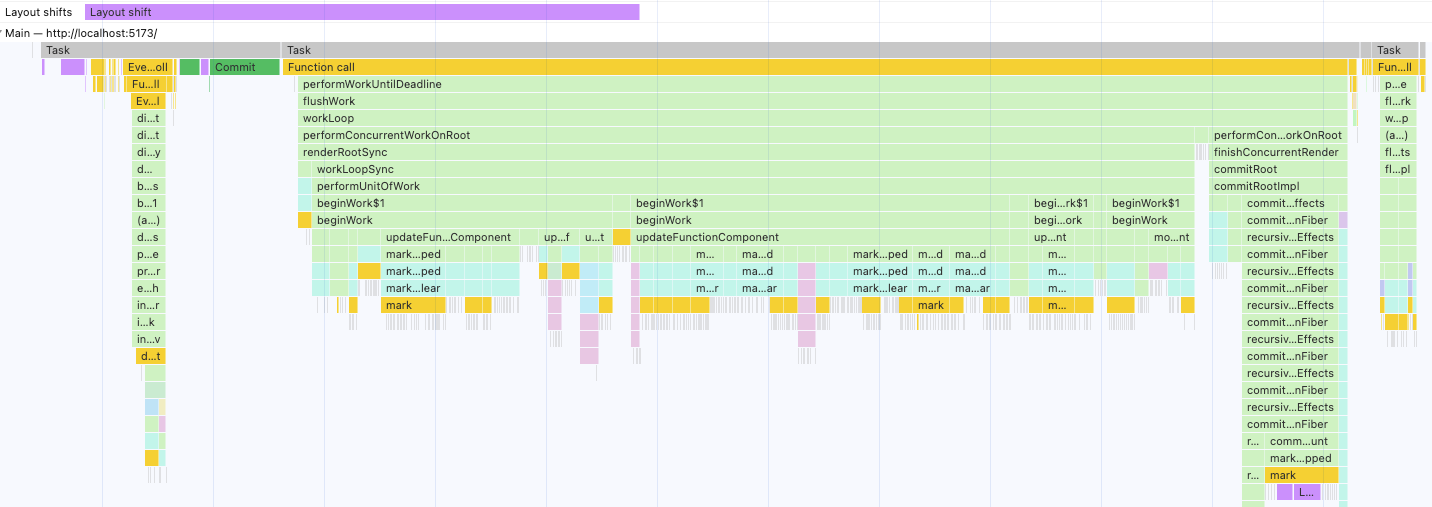
This is a frame from the middle of a sequence of scroll events. You can see that React returns to the event loop immediately after the scroll event is received, the browser paints the content from the previous frame and then React renders and updates the DOM for the new scroll position.
Play with the samples. You can’t tell that what you’re seeing is a frame behind because each frame is consistent.
Next Time
Next time we’ll see how we can make use of these new super powers in our React Spreadsheet.