My VirtualList and VirtualGrid components use the same approach as React-Window. A lean and mean implementation that focuses just on virtualization. This is not SlickGrid. The idea is that you can use customization to build whatever higher level functionality you need on top.
Which is handy, because the whole point of building these controls is so that I can build a spreadsheet frontend with them. Unfortunately, the current implementation is rather lacking in customization features. Let’s fix that and see if there’s a path towards something more like a spreadsheet.
Component Structure
VirtualList and VirtualGrid use the same structure as most other virtualized scrollable components. There are three levels.
At the top there’s an outer container element. It provides a viewport onto the collection of items displayed in the component.
The outer container scrolls over a much larger inner child container element. The inner container is sized so that it can accommodate all the items in the collection.
Finally, all the visible items (and some just out of view) are added as children of the inner container.

The items are rendered using instances of a child component passed in by the caller. The item sizes are specified by an instance of the ItemOffsetMapping interface. Currently, these make up the only form of customization available. The items can be whatever you want but you have no control over the inner and outer container elements.
const Row = ({ index, style }) => (
  <div className={"row"} style={style}>
    { ("Item " + index }
  </div>
);

const mapping = useVariableSizeItemOffsetMapping(30, [50]);

...

<VirtualList
  height={240}
  itemCount={1000000000000}
  itemOffsetMapping={mapping}
  width={600}>
  {Row}
</VirtualList>
Class Names
The first change I’m making is to allow users to specify a className for the container elements. That allows you to target each element in a style sheet.
<VirtualList
  ...
  className={'outerContainer'}
  innerClassName={'innerContainer'}>
  {Row}
</VirtualList>
Most of the time you’ll want to style the outer container and let the inner container and items inherit from it. It makes sense to think of this as the className for the component as a whole. Use innerClassName for the rarer cases where you need to explicitly target the inner component.
I added a className to all my samples with a style that makes the edges of the list and grid components easy to see.
.outerContainer {
  border: 1px solid #d9dddd;
}
Custom Container Components
The container elements in my current implementation are simply divs in the rendered JSX that I pass a few properties to, including the new className properties.
<div className={className} onScroll={onScroll} ref={outerRef}
    style={{ position: "relative", height, width, overflow: "auto", willChange: "transform" }}>
  <div className={innerClassName} style={{ height: isVertical ? renderSize : "100%", width: isVertical ? "100%" : renderSize }}>
  ...
  </div>
</div>
I could think of the sort of customizations people might want to make and add special case props that change the rendered JSX. Which sounds like a tedious game of whack-a-mole. Luckily, there’s a much simpler and more flexible way of enabling container customization. Once again, I’m grateful to react-window for the idea.
Interface
All I need to do is provide a couple of optional props that allow the client to pass in their own custom components to use as the outer and inner containers.
export interface VirtualListProps extends VirtualBaseProps {
  ...
  outerComponent?: VirtualOuterComponent;
  innerComponent?: VirtualInnerComponent;
};
Typing
The custom components have to meet some basic requirements. They both need to render a div and pass className, children and style to it. The outer component also needs an onScroll property and to forward a ref to the div.
How should I declare the types for VirtualOuterComponent and VirtualInnerComponent?
It should be easy. I’ve done it before when declaring a type for the child item component. We define a type that represents the basic properties that need to be passed to the div. Then wrap that with React.ComponentType to declare a type for a React user defined component that accepts the required props.
export interface VirtualInnerProps {
  className: string | undefined;
  children: React.ReactNode;
  style: React.CSSProperties;
}
export type VirtualInnerComponent = React.ComponentType<VirtualInnerProps>;

export interface VirtualOuterProps {
  className: string | undefined;
  children: React.ReactNode;
  style: React.CSSProperties;
  onScroll: (event: ScrollEvent) => void;
}
export type VirtualOuterComponent = React.ComponentType<VirtualOuterProps>;
The ref property isn’t included in VirtualOuterProps because refs are a special case. Core React handles binding refs to elements. The minimal implementation of a custom outer component looks like this.
const Outer = React.forwardRef<HTMLDivElement, VirtualOuterProps >(({className, style, onScroll, children}, ref) => (
  <div className={className} ref={ref} style={style} onScroll={onScroll}>
    {children}
  </div>
)
You can simplify this further for any props that are just being passed through, using JavaScript spread syntax. There’s an additional benefit that your code will continue to work correctly if I add more props in future.
const Outer = React.forwardRef<HTMLDivElement, VirtualOuterProps >(({...rest}, ref) => (
  <div ref={ref} {...rest} />
)
As you might expect, you get TypeScript errors if you try to pass in a component that doesn’t accept the required properties. However, what happens if you forget the forwardRef nonsense?
Nothing. No complaints from TypeScript. Which is understandable. We haven’t mentioned a ref property in VirtualOuterProps and React.ComponentType<VirtualOuterProps> covers all components that accept the basic props, whether they support refs or not.
I went down a rabbit hole trying increasingly exotic type signatures for VirtualOuterComponent. Nothing worked. Either it made no difference or it would prevent any implementation from working. In the end I had to give up. The wisdom of the internet suggests that it can’t be done.
There is a silver lining. At least there’s a runtime error if the component you pass in can’t accept a ref.

Implementation
After all that messing around with types, the implementation in VirtualList and VirtualGrid turned out to be trivial.
const Outer = props.outerComponent || 'div';
const Inner = props.innerComponent || 'div';

...

<Outer className={className} onScroll={onScroll} ref={outerRef}
    style={{ position: "relative", height, width, overflow: "auto", willChange: "transform" }}>
  <Inner className={innerClassName} style={{ height: isVertical ? renderSize : "100%", width: isVertical ? "100%" : renderSize }}>
  ...
  </Inner>
</Outer>
Examples
I added a couple of new samples to showcase the customization possibilities. You can find them embedded below or you can explore the full set of samples.
Padding
I started by copying a simple sample from react-window that adds some padding to the top and bottom of a list.
const PADDING_SIZE = 10;

const Row = ({ index, style }: { index: number, style: React.CSSProperties }) => (
  <div
    style={{
      ...style,
      top: style.top as number + PADDING_SIZE
    }}>
    { "Item " + index }
  </div>
);

const Inner = React.forwardRef<HTMLDivElement, VirtualInnerProps >(({style, ...rest}, ref) => (
  <div
    ref={ref}
    style={{
      ...style,
      height: style.height as number + PADDING_SIZE * 2
    }}
    {...rest}
  />
))

...

<VirtualList
  ...
  className={'outerContainer'}
  innerComponent={Inner}>
  {Row}
</VirtualList>
A custom inner component increases the size of the inner container to allow for the padding. Each item is shifted down by the padding amount.
I wouldn’t choose this implementation myself but it shows the flexibility you have. Try it for yourself.
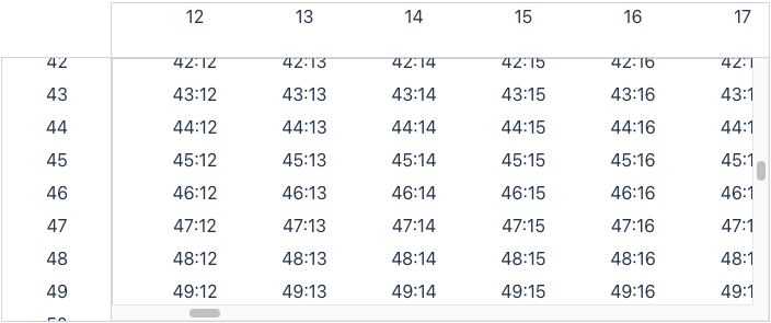
Spreadsheet
Let’s try something a little more challenging. A spreadsheet has fixed row and column headers that are always visible. There’s a react-window sample that shows how to implement “sticky” rows. It uses a custom inner component that always renders the sticky rows and uses position: sticky and z-index styles to ensure that the rows are always visible and always in the same place.
I decided to try a different approach. If you look at a real spreadsheet, like Google Sheets, you’ll see that the scrollbars only cover the extent of the main grid.
I can achieve that and have much more flexibility by using separate controls for the headers. A quick and dirty way of doing that is to use my VirtualList controls. I can use the onScroll callback I implemented last time to scroll the headers to match the main grid. All I need to do is hide the scrollbars on the header controls.
The overflow: hidden style will do the trick. I can override most styles by specifying a className prop and adding the corresponding entries to my sample app’s style sheet. However, styles that are critical to the virtual scrolling implementation are defined inline. To override them I’ll need a custom outer component.
const Outer = React.forwardRef<HTMLDivElement, VirtualOuterProps >(({style, ...rest}, ref) => (
  <div ref={ref} style={{ ...style, overflow: "hidden"}} {...rest}/>
))
Then I can wire up my three components like this.
const columnRef = React.useRef<VirtualListProxy>(null);
const rowRef = React.useRef<VirtualListProxy>(null);

function onScroll(rowOffsetValue: number, columnOffsetValue: number) {
  columnRef.current?.scrollTo(columnOffsetValue);
  rowRef.current?.scrollTo(rowOffsetValue);
}

...

<VirtualList
  ...
  ref={columnRef}
  outerComponent={Outer}>
  {Col}
</VirtualList>

<VirtualList
  ...
  ref={rowRef}
  outerComponent={Outer}>
  {Row}
</VirtualList>

<VirtualGrid
  ...
  onScroll={onScroll}>
  {Cell}
</VirtualGrid>
Try it!
Conclusion
All that’s left is to update my unit tests (sorry TDD lovers) and push out a new release.
Today I learned the limits of static typing as a substitute for documentation and runtime errors. Even if you could enforce use of an Outer component with the correct interface, you still need to rely on documentation that covers what is expected of the implementation. Which reminds me that I don’t have any formal documentation. Something to look at next time.
On the plus side, all the initial functionality I planned to include in react-virtual-scroll is now complete. I can transition over to starting work on my spreadsheet frontend and updating react-virtual-scroll when I find issues.