Now that I have Storybook bootstrapped, I’m going through all my InfiniSheet components creating stories. The process is mostly really straightforward. However, I am finding cases where I need to use additional Storybook features.
You’ll probably need them too.
CSS
I want my components to look acceptable when I publish the Storybook, so I’ll need to add some styling. I don’t have any CSS for the react-virtual-scroll components. The assumption is that clients will use their own.
I took the easy way out and decided to use the CSS from react-spreadsheet for all the components. Most of the react-virtual-scroll components are used internally by react-spreadsheet so I should be able to find relevant styles.
Storybook supports a variety of ways to import CSS. The simplest approach for me was to add import '@candidstartup/react-spreadsheet/VirtualSpreadsheet.css' to the preview.ts Storybook config file. This config controls how a story is rendered and makes the styles available to all stories.
While I was at it, I also moved autodocs and layout: 'centered' config here to avoid having to repeat it in each stories file.
Complex Props
Storybook provides usable controls for changing simple scalar props. Complex props like objects, functions and JSX are more difficult. I ended up hardcoding them in the first stories I wrote, which isn’t ideal.
I want the user to be able to reach the same state as any story by starting with the default component and changing props or interacting with it. That means exposing complex props in a simplified but still meaningful way.
Arg Mapping
The simplest approach is Storybook’s arg mapping feature. Instead of hard coding a different complex prop value in each story, define them all in an arg mapping table. The user can switch between them using a drop down selector.
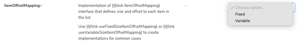
Many of my components take an instance of the ItemOffsetMapping class to define the layout of items in lists and grids. I defined mappings for a couple of common cases, one with fixed size items and one with variable sized items (larger header item).
const mappingVariableVertical = useVariableSizeItemOffsetMapping(30, [50]);
const mappingFixedVertical = useFixedSizeItemOffsetMapping(30);

const meta = {
  title: 'react-virtual-scroll/VirtualList',
  component: VirtualList,
  argTypes: {
    itemOffsetMapping: {
      options: ['Fixed', 'Variable'],
      mapping: {
        Fixed: mappingFixedVertical,
        Variable: mappingVariableVertical
      }
    }
  }
} satisfies Meta<typeof VirtualList>;
Rewriting Args
Sometimes the complex prop is dependent on values of other props. By using a custom render function, you can intercept and modify any arg before it gets passed as a prop to the component.
My VirtualList component can be used with a horizontal or vertical layout. Items in a horizontal list need more space. Instead of making the user ensure they pick a reasonable combination of layout and itemOffsetMapping, I choose the most appropriate value for the current combination of Fixed/Variable and Horizontal/Vertical.
const meta = {
  title: 'react-virtual-scroll/VirtualList',
  component: VirtualList,
  render: ( {layout, itemOffsetMapping, ...args}) => (
    <VirtualList
      layout={layout}
      itemOffsetMapping={rewriteMapping(itemOffsetMapping, layout)}
      {...args}
    />
  )
} satisfies Meta<typeof VirtualList>;
I got into a mess with types when I tried to rewrite the children argument. The magic Meta<typeof VirtualList> type inference wasn’t quite up to the job. I had to be more explicit to get it to work.
const meta: Meta<VirtualListProps> = {
  title: 'react-virtual-scroll/VirtualList',
  component: VirtualList,
  render: ( {layout, children: _children, itemOffsetMapping, ...args}) => (
    <VirtualList
      layout={layout}
      itemOffsetMapping={rewriteMapping(itemOffsetMapping, layout)}
      {...args}>
      {layout === 'horizontal' ? Column : Row}
    </VirtualList>
  )
};
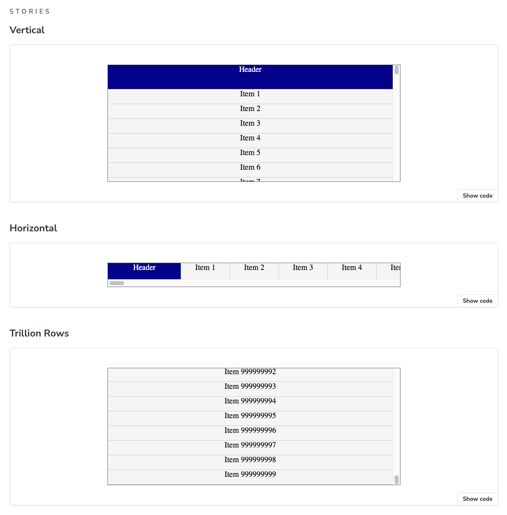
With those foundations in place, it’s simple to write stories that cover a range of VirtualList behavior. All with simple arg values which can be set using the interactive Storybook controls.
export const Vertical: Story = {
  args: {
    className: 'VirtualSpreadsheet_CornerHeader',
    children: Row,
    itemCount: 100,
    itemOffsetMapping: mappingVariableVertical,
    width: 600,
    height: 240,
  },
};

export const Horizontal: Story = {
  args: {
    className: 'VirtualSpreadsheet_CornerHeader',
    layout: 'horizontal',
    children: Column,
    itemCount: 100,
    itemOffsetMapping: mappingVariableHorizontal,
    width: 600,
    height: 50,
  },
};

export const TrillionRows: Story = {
  args: {
    className: 'VirtualSpreadsheet_CornerHeader',
    children: Row,
    itemCount: 1000000000,
    itemOffsetMapping: mappingVariableVertical,
    width: 600,
    height: 240,
  },
};
Notice the nice touch where Storybook automatically displays the “TrillionRows” story as “Trillion Rows”. I initially set an explicit storyName until the Storybook linter told me it wasn’t necessary.
Custom Args
VirtualScroll has imperative scrollTo and scrollToItem methods accessible via a ref to a VirtualScrollProxy imperative handle. My existing sample app lets you try them out. I want to do the same in Storybook.
You don’t need to have a 1:1 mapping of args to props. You can create whatever additional args you want for your own purposes and make use of them in your rendering method.
First define a type that describes the extended set of args.
type VirtualListPropsAndCustomArgs = VirtualListProps & {
  scrollToOffset?: number,
  scrollToItem?: number
};
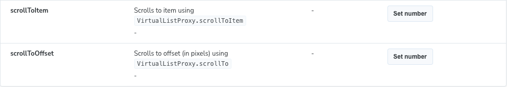
Next, add definitions for the new args so the Storybook UI knows how to display them. I put the custom args in a separate category so the user won’t confuse them with normal component props.
const meta: Meta<VirtualListPropsAndCustomArgs> = {
  argTypes: {
    scrollToItem: {
      description: "Scrolls to item using `VirtualListProxy.scrollToItem`",
      table: {
        category: "Interactive",
      },
      control: {
        type: 'number'
      }
    },
    scrollToOffset: {
      description: "Scrolls to offset (in pixels) using `VirtualListProxy.scrollTo`",
      table: {
        category: "Interactive",
      },
      control: {
        type: 'number'
      }
    },
  }
}
Finally, update the render function to intercept the custom args.
const meta: Meta<VirtualListPropsAndCustomArgs> = {
  render: ( { scrollToItem, scrollToOffset, ...args }) => {
    const listProxy = React.useRef<VirtualListProxy>(null);

    React.useEffect(() => {
      if (scrollToItem !== undefined) {
        listProxy.current?.scrollToItem(scrollToItem)
      }
    }, [scrollToItem])

    React.useEffect(() => {
      if (scrollToOffset !== undefined) {
        listProxy.current?.scrollTo(scrollToOffset)
      }
    }, [scrollToOffset])

    return <VirtualList ref={listProxy} {...args}/>
  }
}
The Storybook render method behaves just like a React component render method, which means you can use React hooks. I need a useRef hook for the VirtualListProxy and useEffect hooks to call the imperative methods after the UI has rendered.
The hooks take the arg values as dependencies so that they’re only triggered if the user updated the custom arg controls since the last render.
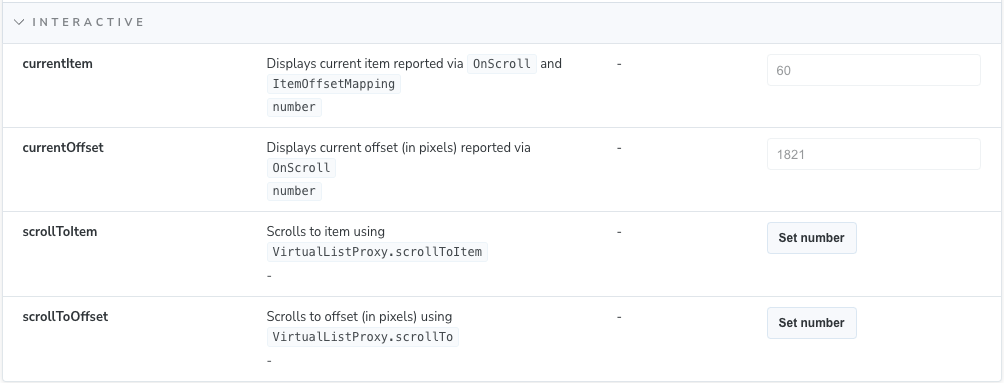
Updating Args
Storybook provides a useArgs hook that allows you to update the value of args. You can use this to display the current state reported by event handlers. Raw event data is already available in the actions tab, but this is easier to consume.
I added new custom args and arg definitions for currentOffset and currentItem. The args are defined as read only. Then I updated the render method to add an onScroll handler that updates the new args.
const meta: Meta<VirtualListPropsAndCustomArgs> = {
  render: ( { layout, itemOffsetMapping, onScroll, currentItem, currentOffset, ...args}) => {
    const [_, updateArgs] = useArgs();

    const currentMapping = rewriteMapping(itemOffsetMapping, layout);

    function ScrollHandler(offset: number, newScrollState: ScrollState): void {
      if (onScroll)
        onScroll(offset, newScrollState);

      if (offset != currentOffset)
        updateArgs({ currentOffset: offset });

      const [item] = currentMapping.offsetToItem(offset);
      if (item != currentItem)
        updateArgs({ currentItem: item });
    }

    return <VirtualList layout={layout} itemOffsetMapping={currentMapping}
        onScroll={ScrollHandler} {...args}/>
  },
As normal for modern React, ScrollHandler is defined as a nested function within the render function so that it has access to props and state. We need to make sure that we also call any handler passed through as an arg. This is how Storybook adds events to the “Actions” tab.
Note that the conversion from offset to item needs access to the current itemOffsetMapping.
After all that, this is what the combined set of custom args looks like.
Full Screen
The AutoSizer component calculates the size available to it, then passes the measured width and height to its children. This only works if the parent component allows it to expand. With the default Storybook settings, AutoSizer gets squashed down to a 20 pixel square.
There’s a helpful discussion in a Storybook issue. Fixing this needs two things.
First, override the layout parameter to fullscreen. This removes any padding and allows AutoSizer to use the full width of the iframe it’s rendered in.
Despite the name, fullscreen doesn’t by itself allow components to use the full height of the iframe. To fix that, add a decorator which wraps the component in a div with a height set to 100% of the viewport height.
const meta: Meta<AutoSizerProps> = {
  decorators:
    (Story) => (
      <div style={{ height: '100vh' }}>
        <Story/>
      </div>
    )
  ],
  parameters: {
    layout: 'fullscreen'
  }
};
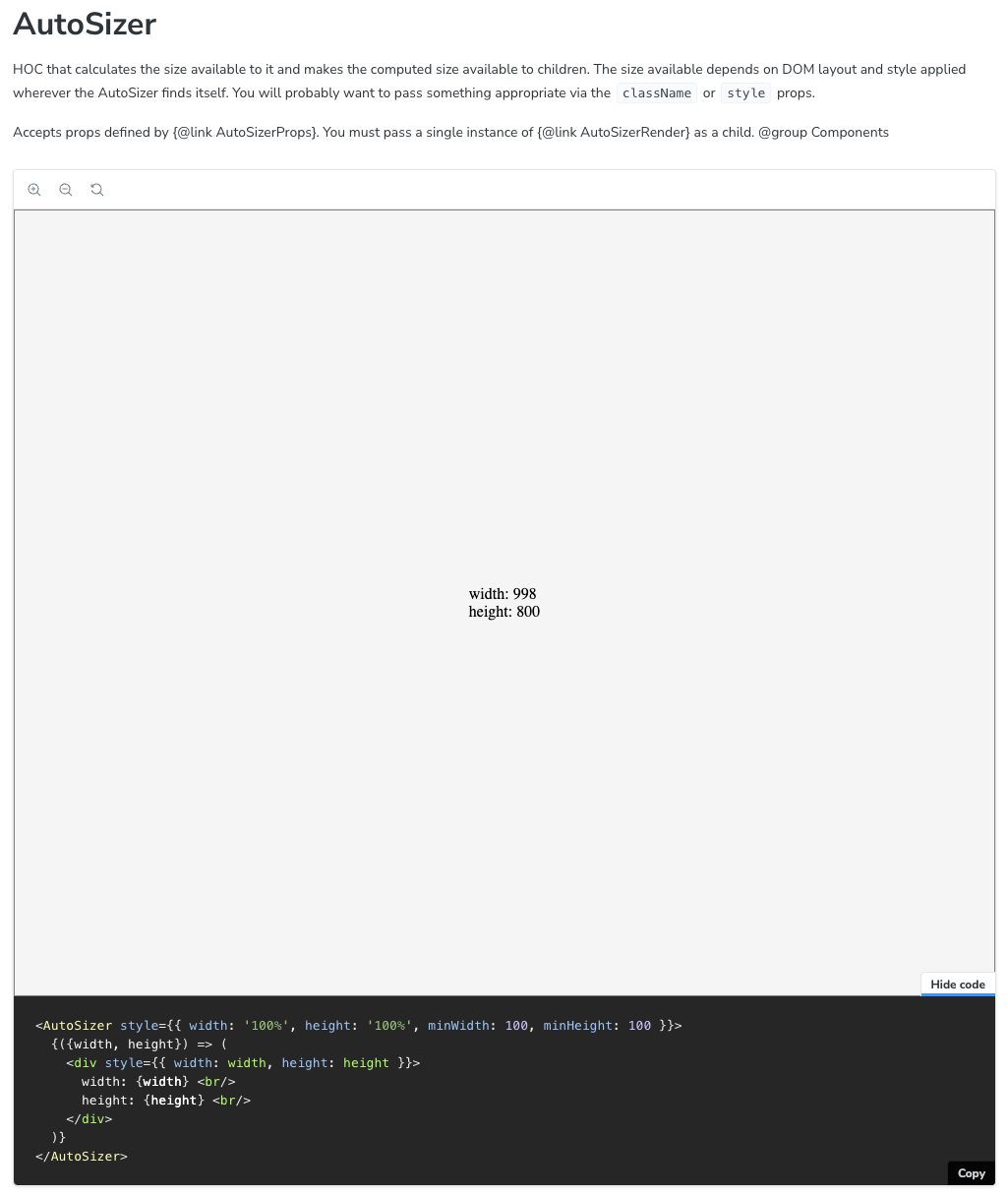
Custom Display Code
Storybook auto-generates code from the rendered JSX. Most of the time this gives a good impression of how to use the component. This isn’t useful for AutoSizer as it expects a render function as a child. I provided explicit code to display instead.
const displayCode = `
<AutoSizer style={{ width: '100%', height: '100%', minWidth: 100, minHeight: 100 }}>
  {({width, height}) => (
    <div style={{ width: width, height: height }}>
      width: {width} <br/>
      height: {height} <br/>
    </div>
  )}
</AutoSizer>`

const meta: Meta<AutoSizerProps> = {
  parameters: {
    docs: {
      source: {
        type: 'code',
        code: displayCode
      }
    }
  }
};
Interactions
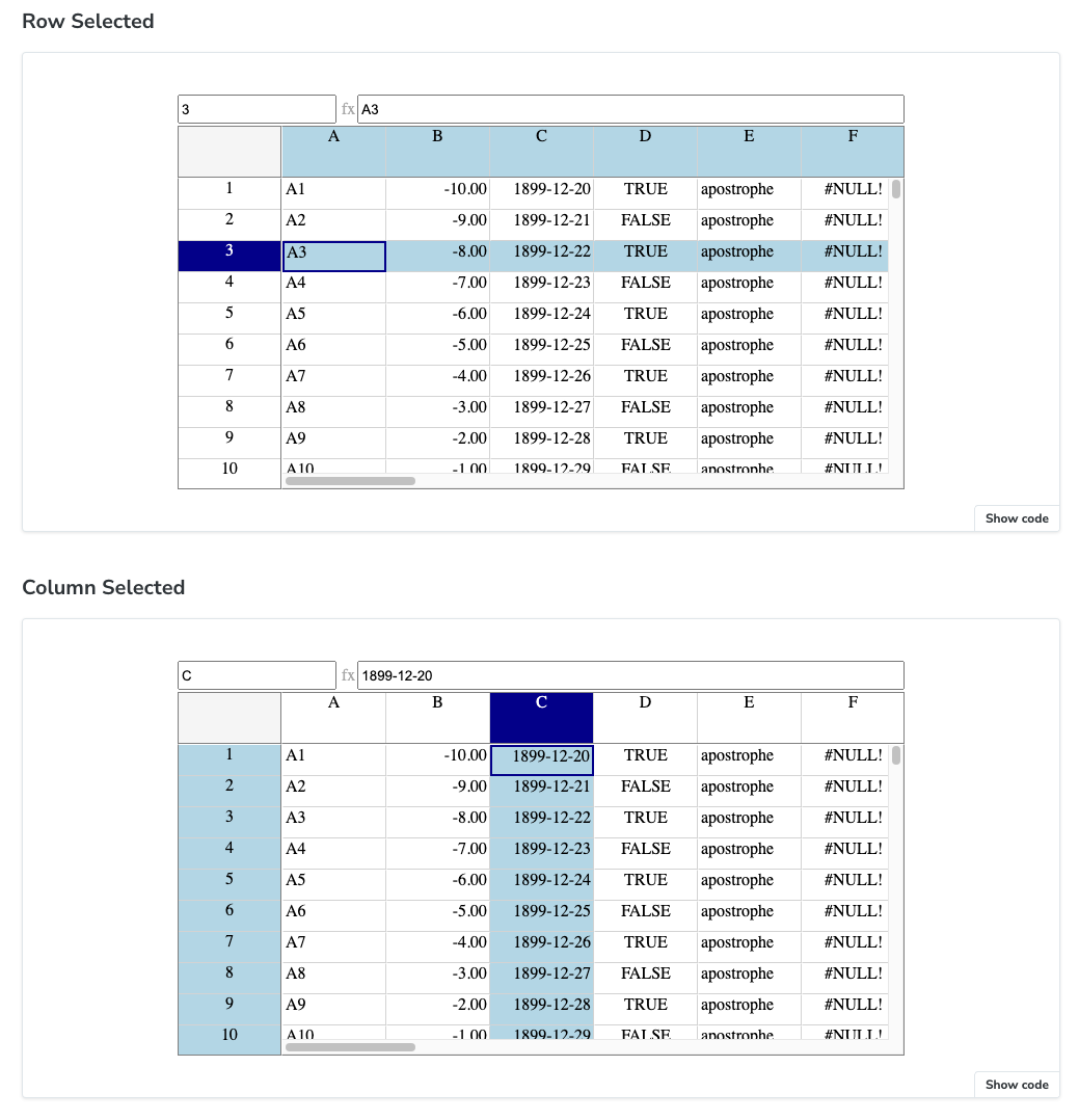
Sometimes you need to interact with a component to get it into a particular visual state. I want to include stories that show row, column and cell selection states for my VirtualSpreadsheet component.
Storybook supports Play functions which run a small snippet of code after a story renders. Storybook provides integrated versions of Testing Library and Vitest APIs for use in play functions.
Play functions are async and invoked with a canvas element that gives you access to the root of your component. From there, you can use a combination of locators and actions that look very similar to what we saw with Playwright and Vitest Browser Mode.
export const RowSelected: Story = {
  args: {
    theme: theme,
    data: testData,
    width: 600,
    height: 300,
  },
  play: async ({ canvasElement }) => {
    const canvas = within(canvasElement);
    const row = canvas.getByText("3");
    await userEvent.click(row);
    const name = canvas.getByTitle("Name");
    await expect(name).toHaveProperty('value', "3");
  }
};
I included a simple check that the correct visual state has been achieved. The results are visible in the Storybook “Interactions” tab.
The first time I tried it out, my spreadsheet went haywire. It somehow ended up selecting the non-existent row -5, screwing up the grid layout in the process.
It turns out the click event generated by Testing Library has client X and Y coordinates set to zero, regardless of what you’ve clicked on. My event handling logic assumes the click coordinates are within the grid rather than outside the grid at the top left of the page.
I need a more defensive implementation. You can imagine other forms of automation that also generate bogus events. I updated the handler so that we first check whether the client coords are inside the target element. If not, we assume the center of the target element was clicked.
The final oddity is that by default the play function doesn’t run for stories on the auto-generated Docs page. If you’re sure that it’s safe to run multiple play functions simultaneously, you can use parameters.docs.story.autoplay to enable them.
My play functions are incredibly simple, so I turned this on.
HMR
As you incrementally add new components and stories, you will sometimes find that the HMR doesn’t work correctly. The new component/story appears in the menu but when selected displays an incomprehensible error message.
Restarting the server sorts it out.
Next Time
I now have a full set of stories covering all my components. I’d love to let you try it out but first I need to work out how to publish Storybook to the blog. However, before I do that there’s one last niggling thing to fix.
The autodocs generated documentation is full of TSDoc markup that hasn’t been handled properly. Surely there’s some addon that can interpret it properly or at least filter it out?
It turns out to be quite the rat hole, which will have to wait until next time.