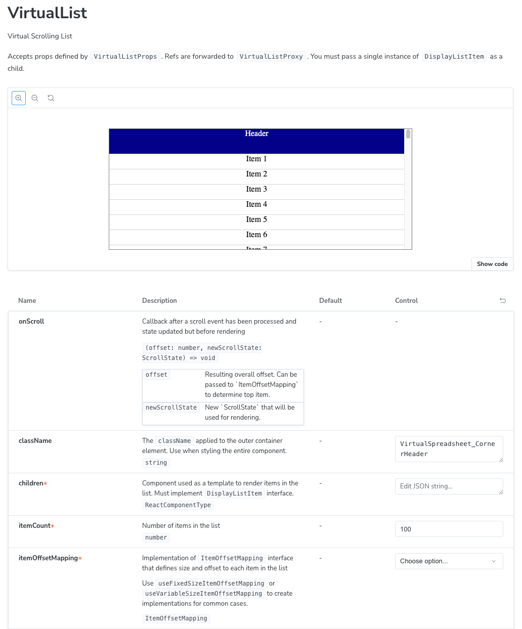
Last time, I put together a storybook for my InfiniSheet project. There was one outstanding issue.
The Autodocs generated interactive reference documentation is riddled with TSDoc markup that Storybook doesn’t understand. Storybook uses source code static analysis to determine the arguments for each component and extract comments. It generally does a decent job, it just needs a little help with the last ten percent.
TSDoc Markup
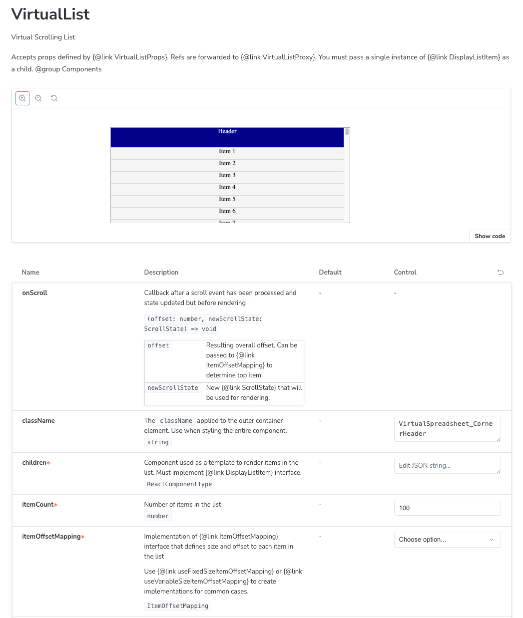
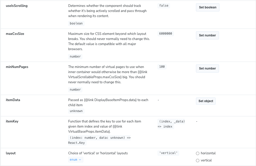
Many TSDoc tags are supported, generally the most basic tags shared with JSDoc. This includes the @param tag used to document the arguments to the onScroll callback handler.
Some tags, like @defaultValue, are stripped out and then ignored. This is particularly annoying as the UI has a column for Default that is left unpopulated. Some, including the @link and @group tags, aren’t understood at all and come through as is.
There’s also some odd choices when describing the types of props. The onScroll handler is given the accurate and detailed (offset: number, newScrollState: ScrollState) => void followed by descriptions of each parameter. However, the layout enum is simply described as union rather than the more useful 'horizontal'|'vertical'.
Addons and Customization
Surely there must be some addon or customization that I can use to fix this. I tried a few internet searches and found nothing. The documentation mentions JSDoc comments in passing in a few places but no details of what’s supported.
The generated documentation is created from a set of Doc Blocks using a template which you can customize. The Description and Controls doc blocks display descriptions extracted from my TSDoc comments.
You can customize doc blocks using the Storybook parameters mechanism. Unfortunately, there’s nothing documented that would let me hook in and handle the TSDoc tags myself.
You can write your own Doc blocks which have access to the annotated component data including args and description. However, it seems like overkill to reimplement the Controls UI from scratch just to manipulate the extracted descriptions first.
Storybook Source Code
I decided to have a look at the source code. The Controls block uses an ArgTypesExtractor function to extract metadata for each argument. Interestingly, the extractor is passed to it via a docs.extractArgTypes parameter.
Parameters is a general Storybook system for managing and sharing named metadata across the Storybook ecosystem. More importantly, parameters can be overridden globally or per component or story.
The Description block works in a similar way, using a function passed in via a docs.extractComponentDescription parameter.
Hooking Extraction Functions
It looks like null is an acceptable return type for each function so I can do a quick test to see if I can override them in the preview.ts config file.
const preview: Preview = {
  parameters: {
    docs: {
      extractComponentDescription: () => { return null },
      extractArgTypes: () => { return null }
    }
  }
};
On saving, HMR kicks in and Storybook updates itself.
It works. We have a way in.
Now that I know what I’m looking for, I found a couple of mentions that suggest this is a somewhat supported approach. Some more searching through source code suggests the following type signatures for the functions.
type ArgTypesExtractor = (component: Component) => StrictArgTypes | null;
type ExtractComponentDescription = (component: Component) => string | null;
Logging Extraction Functions
I updated my hooks and logged the component object to the console. Here’s the relevant parts.
{
  "__docgenInfo": {
    "description": "Virtual Scrolling List\n\nAccepts props defined by {@link VirtualListProps}. \nRefs are forwarded to {@link VirtualListProxy}. \nYou must pass a single instance of {@link DisplayListItem} as a child.\n@group Components",
    "displayName": "VirtualList",
    "props": {
      "className": {
        "required": false,
        "tsType": {
          "name": "string"
        },
        "description": "The `className` applied to the outer container element. Use when styling the entire component."
      },
      "children": {
        "required": true,
        "tsType": {
          "name": "ReactComponentType",
          "raw": "React.ComponentType<DisplayListItemProps>",
        },
        "description": "Component used as a template to render items in the list. Must implement {@link DisplayListItem} interface."
      },
      "itemCount": {
        "required": true,
        "tsType": {
          "name": "number"
        },
        "description": "Number of items in the list"
      },
      "itemOffsetMapping": {
        "required": true,
        "tsType": {
          "name": "ItemOffsetMapping"
        },
        "description": "Implementation of {@link ItemOffsetMapping} interface that defines size and offset to each item in the list\n\nUse {@link useFixedSizeItemOffsetMapping} or {@link useVariableSizeItemOffsetMapping} to create implementations\nfor common cases."
      },
      "onScroll": {
        "required": false,
        "tsType": {
          "name": "signature",
          "type": "function",
          "raw": "(offset: number, newScrollState: ScrollState) => void",
        },
        "description": "Callback after a scroll event has been processed and state updated but before rendering\n@param offset - Resulting overall offset. Can be passed to {@link ItemOffsetMapping} to determine top item.\n@param newScrollState - New {@link ScrollState} that will be used for rendering."
      },
    }
  }
}
It looks like it includes everything needed to populate the UI, after I’ve handled the TSDoc tags.
Returning Fake Data
It took a while to find a public definition of the StrictArgTypes return value. It’s defined in the separate ComponentDriven/csf repo.
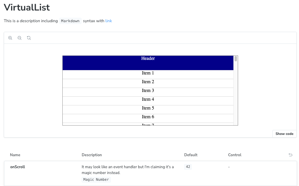
Basically, StrictArgTypes is the same as Storybook’s documented ArgTypes. Let’s try returning some fake data. The descriptions seem to support Markdown, so let’s test that.
const preview: Preview = {
  parameters: {
    docs: {
      extractComponentDescription: (component) => {
        return "This is a *description* including `Markdown` syntax with [link](https://www.thecandidstartup.org/)"
      },
      extractArgTypes: (component) => {
        return {
          onScroll: {
            description: "It may look like an event handler but I'm claiming it's a magic number instead.",
            table: {
              defaultValue: {
                summary: "42"
              },
              type: {
                summary: "Magic Number"
              }
            }
          }
        }
      }
    }
  }
}
Now Storybook looks like this.
Reusing Existing Conversion Code
How much of the existing conversion code can we reuse rather than rewriting it from scratch? The implementation of extractArgTypes that I’m overriding is defined deep inside React framework support and not exported.
Most framework support, including React, makes use of a common docs-tools library which is exported. The code calls extractComponentProps from docs-tools, performs some React specific “enhancements” and then reformats the data as StrictArgTypes.
The first and last steps are simple enough to replicate. The enhancement process involves a lot of very verbose code spread over multiple modules which, ironically, is dedicated to nicely formatting the default values that docs-tools has failed to extract. I won’t need any of that as I can just use the @defaultValue tag from my TSDoc comments.
Logging Extracted Component Props
I logged the returned values from extractComponentProps to the console. The format is extremely verbose so I’ll restrict myself to a couple of informative snippets.
The format is an array of objects, one for each prop. Each object includes a number of keys of which two are relevant to me. The propDef key is another object which includes all the processed data in a form that’s mostly compatible with StrictArgDefs. The docgenInfo key includes the original data from the component object.
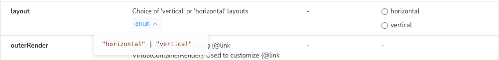
Here’s what it looks like for the layout prop.
  {
    "propDef": {
      "name": "layout",
      "type": {
        "summary": "union"
      },
      "required": false,
      "description": "Choice of 'vertical' or 'horizontal' layouts",
      "defaultValue": null,
      "sbType": {
        "raw": "\"horizontal\" | \"vertical\"",
        "name": "enum",
        "value": [
            "horizontal",
            "vertical"
        ]
      }
    },
    "docgenInfo": {
      "required": false,
      "tsType": {
        "name": "union",
        "raw": "\"horizontal\" | \"vertical\"",
      },
      "description": "Choice of 'vertical' or 'horizontal' layouts\n@defaultValue 'vertical'"
    }
  }
Two points to notice. First, the original docgen description includes a @defaultValue tag which has been stripped out and ignored. Second, docs-tools has recognized that this is an enum, extracted the allowed values and still decided to summarize the type as union.
Let’s look at something more complex. Here’s the onScroll handler.
  {
    "propDef": {
      "name": "onScroll",
      "type": {
          "summary": "(offset: number, newScrollState: ScrollState) => void"
      },
      "required": false,
      "description": "Callback after a scroll event has been processed and state updated but before rendering",
      "defaultValue": null,
      "sbType": {
          "raw": "(offset: number, newScrollState: ScrollState) => void",
          "name": "function"
      },
      "jsDocTags": {
        "params": [
          {
            "name": "offset",
            "description": "Resulting overall offset. Can be passed to {@link ItemOffsetMapping} to determine top item."
          },
          {
            "name": "newScrollState",
            "description": "New {@link ScrollState} that will be used for rendering."
          }
        ],
        "deprecated": null,
        "returns": null,
        "ignore": false
      }
    },
    "docgenInfo": {
      "required": false,
      "tsType": {
        "name": "signature",
        "type": "function",
        "raw": "(offset: number, newScrollState: ScrollState) => void",
      },
      "description": "Callback after a scroll event has been processed and state updated but before rendering\n@param offset - Resulting overall offset. Can be passed to {@link ItemOffsetMapping} to determine top item.\n@param newScrollState - New {@link ScrollState} that will be used for rendering."
    },
    "typeSystem": "TypeScript"
  }
]
In this case, docs-tools has summarized the type using the raw type signature, the opposite approach to what it did with layout. The TSDoc param tags from the original description have been extracted and returned in a jsDocTags object. There’s no mention of jsDocTags in the public ArgTypes documentation.
Returning Extracted Component Props
My starting point is to return the docs-tools extracted data without any enhancements. I can then incrementally improve the output. After condensing the existing code and removing the React specific enhancements I’m left with this.
import type { StrictArgTypes } from 'storybook/internal/types';
import type { ArgTypesExtractor, Component } from 'storybook/internal/docs-tools';
import { extractComponentProps,
  extractComponentDescription as baseExtract } from 'storybook/internal/docs-tools';

export const extractComponentDescription = (component: Component) => {
  const description = baseExtract(component);
  return description;
};

export const extractArgTypes: ArgTypesExtractor = (component) => {
  const props = extractComponentProps(component, 'props');
  if (!props)
    return null;

  return props.reduce((acc: StrictArgTypes, prop) => {
    let {name, description, type, sbType, defaultValue, jsDocTags, required} = prop.propDef;

    acc[name] = { name, description,
      type: { required, ...sbType },
      table: {
        type: type ?? undefined,
        jsDocTags,
        defaultValue: defaultValue ?? undefined,
      }
    }
    return acc;
  }, {});
};
Which gets us back to where we started, confirming that the React enhancements were doing nothing for me.
Now we can start changing things.
Enhanced Types
Let’s start with something simple. I’m going to provide more detail for enum and union types.
  if (sbType.name === 'enum' || sbType.name === 'union')
    type = { summary: sbType.name, detail: sbType.raw };
My first attempt at this put the raw type data in the summary. Annoyingly, the Markdown pipeline in Storybook filters out | characters when formatted in the code style used for types. I tried a few ways of escaping them but nothing worked.
Weirdly, putting the raw type data in the detail does work. I convinced myself that this was an overall improvement as large enums would work better in a pop up.
Supporting TSDoc the Right Way
The right way to parse TSDoc markup is to use the official TSDoc parsing library. TSDoc comments can use the full power of Markdown and Markdown isn’t a regular language. Regular expressions won’t cut it.
However, it seems like overkill for fixing up my simple comments. To use the TSDoc library I’d first need to reformat the description so that it looks like a source code comment. That is, wrapped in /** and */ with a * prefix on each line. Then I’d have to configure the parser to understand the Typedoc custom tags I’m using.
Running the parser produces an incredibly verbose abstract syntax tree output structure. You make changes by writing transformers that walk over the tree and manipulate the structure. Finally, you need to write a formatter that walks over the structure recombining everything back into a string.
It turns out that docs-tools has already done the equivalent using the comment-parser JSDoc parser. This also explains why @defaultValue tags are removed. comment-parser extracts all the tags it supports, but docs-tools doesn’t do anything with @defaultValue.
I’m just fixing a few things up, surely a couple of quick regular expressions can’t hurt?
Default Values
This should be the simplest case as the tag has already been removed from the description by docs-tools. All I have to do is fish any default value out of the original description in docgenInfo. Default value is a block tag and usually gets a line to itself.
  const result =
    prop.docgenInfo.description.match(/\n\s*@defaultValue\s+`*([^\n`]+)`*(\n|$)/);
  if (result)
    defaultValue = { summary: result[1] }
The regexp looks for a newline followed by optional white space then the @defaultValue tag. There’s more white space, then we capture the value until we hit another newline or the end of the string.
Typedoc formats default values using the normal Markdown rules. If you want to use a code style, you have to use the relevant markup. I do this for function defaults.
Storybook appears to always format default values using code styles. If you include the backtick markup it comes through as a literal character. I fixed this in the regular expression by ignoring any backticks that wrap the value.
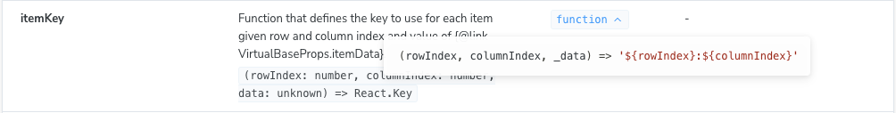
Unfortunately, I’d forgotten about this more complex case
/**
 * Function that defines the key to use for each item given row and
 * column index and value of {@link DisplayBaseProps.itemData}.
 * @defaultValue
 * ```ts
 * (rowIndex, columnIndex, _data) => `${rowIndex}:${columnIndex}`
 * ```
 */
itemKey?: (rowIndex: number, columnIndex: number, data: unknown) => React.Key
Default value is a block tag so includes everything until the start of the next tag or the end of the comment. You can have multiline default values. I had to do it this way because the function definition makes use of backticks and this was the only way of escaping them that worked with Typedoc.
I considered going back to the right way for all of 30 seconds, then changed the definition to remove the backticks.
 /**
  * @defaultValue `(rowIndex, columnIndex, _data) => '${rowIndex}:${columnIndex}'`
This code isn’t literally correct but still does its job of explaining what the default itemKey function does.
It turns out that squashing a function definition into the limited space provided for the “Default” column isn’t very readable. If the value string is longer than 15 characters I return it as detail and use sbType.name as the summary.
Group Tag
This is a custom TypeDoc tag that I use to group components together in the generated documentation. There’s no equivalent in Storybook and no need for one as everything in Storybook is a component. All I need to do is strip the tag out.
const noGroup = description.replace(/\n\s*@group\s+([^\n`]+)(\n|$)/, "");
No drama. This one just worked.
Links
Most links in the descriptions are to interfaces and properties of interfaces. The most appropriate default treatment is to format them as code. I may look at adding actual Markdown links when I add Storybook to my published documentation. I could try and cross-link into the Typedoc generated API documentation. Until then, there’s nothing worth linking to.
function replaceLinks(description: string): string {
  return description.replaceAll(/{@link\s+([^}]+)}/g, (_substring, p1) => {
    const value = p1 as string;
    return "`" + value + "`";
  })
}
I call replaceLinks on component, arg and param descriptions. I was surprised to find that Storybook treats param descriptions as simple text rather than Markdown. The backtick markup comes through as is. However, it looks reasonable enough given that I can’t use any form of styling.
I think the end result is well worth the minimal level of effort that I put in to achieve it.
Next Time
Time to get this thing published so you can play around with it yourselves.