I finally have a storybook that I’m happy to publish. Now I just have to figure out how to get it onto thecandidstartup.org and tie it into the website navigation structure, as well as the existing Typedoc API documentation.
Production Build
I built and ran a Storybook production build for the first time in ages. Which is when I realized that Autodocs were missing. My first thought was a problem with my hacked TSDoc support. I disabled it but it made no difference.
Eventually I realized it’s because the production build uses built packages for projects in the monorepo, rather than importing source code directly. I set it up this way for proper black box component testing.
Autodocs relies on static analysis of source code. In theory you should be able to do the same analysis using the .d.ts typing file built for each package. In practice it doesn’t work.
Storybook documentation calls this out in its troubleshooting section. Under the hood, Storybook relies on react-docgen to do the static analysis. Lack of support for .d.ts is a known issue.
Storybook also supports an alternative tool, react-docgen-typescript. This one uses the TypeScript compiler to parse the code, so should be able to handle .d.ts files. Unfortunately, it doesn’t work either. There’s a known issue for this one too. The package was last updated three years ago, so I don’t hold out much hope that it will be fixed.
Which is a pain. I can’t publish Storybook documentation without a production build against source code, but I want a production build against built packages for component testing.
Two Production Builds
The answer is to create two production builds. Once setup for publishing, the other for testing. Interestingly, Storybook has a --test flag that optimizes builds for testing, in part by stripping out the documentation.
I’m already dynamically tweaking the Vite configuration to control whether Storybook builds against source or packages. It’s easy to update the condition for building against packages to (options.configType === 'PRODUCTION' && options.test).
Unfortunately, the resulting test build is only partially functional. As well as stripping out the documentation, the Controls tab for each story only displays controls for args that were explicitly set in the Story. At least for the Vite React framework, Storybook is relying on the Autodocs static analysis to determine the complete set of props for each component.
It gets worse. The Controls tab often displays no controls at all.
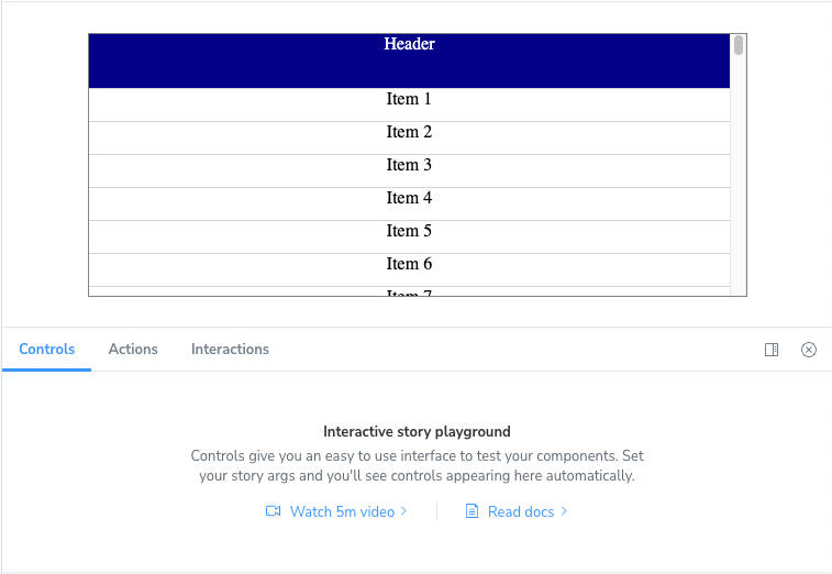
This one is particularly weird. If you open a story directly using the corresponding URL, the controls appear. When you navigate to another story, they don’t. If you refresh the page, they appear. Except for some stories where the controls don’t appear no matter what you do.
There are reports of similar issues, although the reproduction steps are different.
Smoke Test
This is the first time I’ve run into a brick wall with Storybook. For now, I intend to use the test build for simple smoke testing. Just make sure each story renders correctly.
I’ll have to run more complex tests that need to interact with the controls against the regular build. Not ideal but better than nothing.
Theming
Storybook has a simple theming API. You can create a new theme by using one of the existing themes as a base and then overriding theme properties. There’s not much in the way of fine grained control. You can change the branding (Storybook icon), fonts and some of the colors.
There’s no detailed documentation for the theme properties so you’ll need to experiment. I added Candid Startup branding and matched fonts and selected colors with the rest of the site.
import { create } from '@storybook/theming';

export default create({
  base: 'light',

  brandTitle: 'The Candid Startup',
  brandUrl: 'https://thecandidstartup.org',
  brandImage: undefined,
  brandTarget: '_self',

  fontBase:  '"Open Sans", "Helvetica Neue", Helvetica, Arial, sans-serif',
  appBg: '#fdfdfd',
  colorSecondary: '#159957',
  barHoverColor: '#606060',
});
To apply the theme you need to create a new configuration file, manager.ts.
import { addons } from '@storybook/manager-api';
import theme from './theme';

addons.setConfig({
  theme: theme,
});
For some reason, you have to apply the theme separately to the “Docs” pages in preview.ts.
import theme from './theme';

const preview: Preview = {
  parameters: {
    docs: {
      theme: theme,
    }
  }
}
Landing Pages
Theme branding is the only way to add a (single) link into the Storybook navigation bar. I want to show where the InfiniSheet storybook sits within the overall website navigation structure.
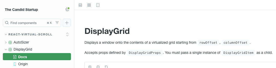
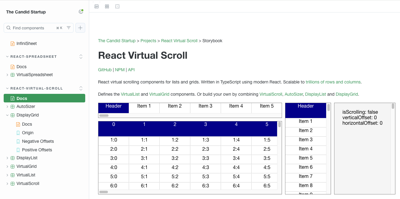
You can add pure documentation pages to Storybook. The simplest thing is to add handwritten documentation landing pages with links back into the main site. I added three pages. One for Infinisheet as a whole, and one each for the react-spreadsheet and react-virtual-scroll packages.
Documentation pages are written in MDX, which is a mashup of Markdown and JSX. You can include Storybook Doc Blocks as well as regular React components.
Each page should include a Meta Doc block which controls how the page is integrated into the navigation hierarchy. For standalone pages like these, you use the title property to specify a path in the hierarchy. If you specify a path to a category or folder, the page uses the standard Autodocs documentation page name (“Docs” by default).
import { Meta } from '@storybook/blocks';

<Meta title="react-virtual-scroll" />
The Story and Canvas blocks allow you to include stories embedded in the page. I used this to showcase examples of react-virtual-scroll components.
Favicon
There’s no direct support for customizing the Storybook favicon. However, you can get it done using a couple of low level customization features.
You can add static assets to your Storybook using the staticDirs configuration option. Files in these directories are copied into the root of your Storybook build, or to a subdir of your choice.
I added an assets directory to my storybook project, copied the Candid Startup favicon.ico into it and added it to staticDirs. Now I just need to reference it by adding a link to the app’s head section.
The simplest way of doing this is to add manager-head.html to the set of Storybook config files. Whatever you put in here is appended to the end of the head section when the app is built.
<link rel="icon" href="favicon.ico">
The app still includes the standard Storybook head section with its link to the Storybook favicon.svg. It’s up to the browser to decide which link to use. In my testing with Chrome, Firefox and Safari, they all picked the Candid Startup favicon. I’ve seen reports of cases where browsers picked the wrong one.
There’s also a more complex approach that gives you programmatic access to the head section. The managerHead configuration option takes a function which is called with the standard head section and returns a customized version. You could use this to remove the standard favicon link if it’s causing problems.
Publishing
I already use GitHub pages to publish Typedoc documentation to the Candid Startup site. GitHub pages publishes to a fixed location for each repo in an organization. For Infinisheet, it goes to thecandidstartup.org/infinisheet.
One of the drawbacks of using a monorepo is that everything I want to publish has to live under the same root. I can put the built Storybook into infinisheet/storybook without interfering with the Typedoc output. I initially thought I’d need to do a special build with a different base path. However, Storybook is a single page app with a single URL. You can put the build output under whatever path you like and it still works.
I added a build-docs script that puts the output into the Typedoc build directory: storybook build -o ../../temp/storybook. I could then create a build-docs script in the monorepo root that builds a combined set of documentation using npx typedoc && npm run build-docs --workspace=@candidstartup/storybook.
Hard won wisdom. When running a workspace script using npm, you have to use the name from the corresponding package.json. Not the folder name you used to define what workspaces you have. The npm documentation is completely misleading.
I thought I would be able to use relative links between Typedoc and Storybook documentation. That way the same build works both locally for testing and when deployed. Unfortunately, relative links don’t work from Storybook to Typedoc because Storybook is a single page app with a router that intercepts local links. I had to use fully qualified URLs which will work when deployed but aren’t ideal for local testing.
As I’m going to be republishing my documentation I took the opportunity to upgrade Typedoc and TypeScript to the latest versions and applied all other pending minor upgrades. It went a lot more smoothly than the last time I tried to upgrade anything.
One thing caught me out. Typedoc 0.27 changed the format used for permalinks. That broke all the Storybook to Typedoc links I’d created as well as breaking the existing links on the blog. I think I’ve updated them all. Let me know if you find any broken links.
GitHub Actions
I need to publish all the pages for Infinisheet in a single deployment step. All I had to do was replace npx typedoc with npm run build-docs in the existing docs.yml workflow.
Blog Updates
As well as fixing the broken Typedoc links, I added additional links to take you to the Storybook landing pages. I extended the system I built for GitHub, NPM and API documentation links.
Try It!
The Infinisheet storybook is now live. Or get there via the Projects page.
Next Time
So much left to do. Do I finish documenting and unit testing react-spreadsheet? Do I fill out a battery of Playwright tests running against my storybook? Maybe I should focus on getting react-spreadsheet to the point where someone else could meaningfully use it.
Or do I switch focus and factor out common interfaces like SpreadsheetData ready to start implementing a spreadsheet backend?
As always, you’ll find out next time.